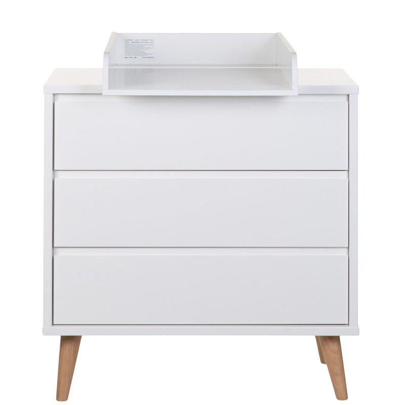
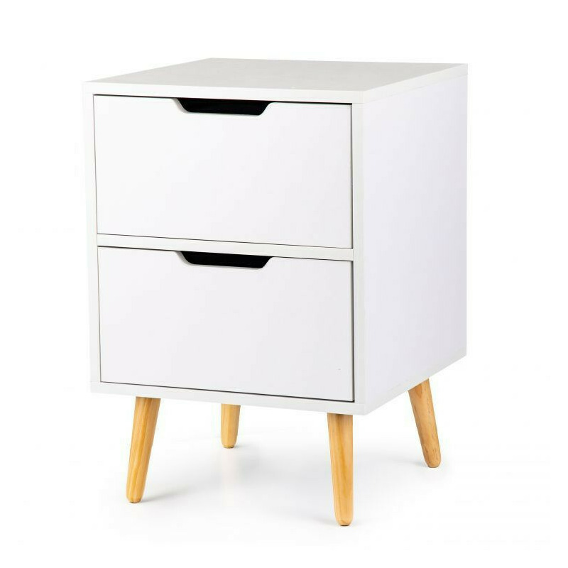
Modernhome Noptiera cu 2 sertare si picioare din lemn masiv de pin, 58 x 40 x 40 cm, modern home, alba.
bd-grid { display: grid; display: grid; grid-template-columns: repeat(3, minmax(0, 1fr)); row-gap: 50px; column-gap: 50px; justify-items: center; text-align: center; } @media screen and (max-width: 600px) { .
bd-grid { display: grid; grid-template-columns: repeat(1, minmax(0, 1fr)); } } .
bd-grid-s { display: grid; display: grid; grid-template-columns: repeat(2, minmax(0, 1fr)); row-gap: 50px; column-gap: 50px; justify-items: center; text-align: center; align-items: center; } @media screen and (max-width: 600px) { .
bd-grid-s { display: grid; grid-template-columns: repeat(1, minmax(0, 1fr)); } } Noptiera cu 2 sertare si picioare din lemn masiv de pin, 58 x 40 x 40 cm, Modern Home, alba.
Caracteristici principale: Perfecta pentru un dormitor sau living; Design modern, scndinav; Culoare alba universala; Suprafete laminate si sertare fara maner; Dimensiune compacta; Stabilitate structurala; Montare simpla si rapida.
Masuri: - totala (inaltime x latime x adancime): 58 x 40 x 40 cm Rezistenta la sarcina: - sertare depozitare: max.
10 kg - blat superior noptiera: max.
10 kg Material: - corp (dulap): Pal - picioare masa: lemn masiv de pin Modernizati-va interiorul cu aceasta noptiera cu un design placut si elegant.
Are un farmec scandinav.
Acest dulap noptiera cu patru picioare din lemn este stabil si robust.
In plus, aceasta noptiera de dormitor este echipata cu doua sertare care ofera spatiu de depozitare amplu pentru a va mentine lucrurile ordonate si organizate.
Se curata usor cu o carpa umeda.
bd-grid { display: grid; display: grid; grid-template-columns: repeat(3, minmax(0, 1fr)); row-gap: 50px; column-gap: 50px; justify-items: center; text-align: center; } @media screen and (max-width: 600px) { .
bd-grid { display: grid; grid-template-columns: repeat(1, minmax(0, 1fr)); } } .
bd-grid-s { display: grid; display: grid; grid-template-columns: repeat(2, minmax(0, 1fr)); row-gap: 50px; column-gap: 50px; justify-items: center; text-align: center; align-items: center; } @media screen and (max-width: 600px) { .
bd-grid-s { display: grid; grid-template-columns: repeat(1, minmax(0, 1fr)); } } .
bd-grid { display: grid; display: grid; grid-template-columns: repeat(3, minmax(0, 1fr)); row-gap: 50px; column-gap: 50px; justify-items: center; text-align: center; } @media screen and (max-width: 600px) { .
bd-grid { display: grid; grid-template-columns: repeat(1, minmax(0, 1fr)); } } .
bd-grid-s { display: grid; display: grid; grid-template-columns: repeat(2, minmax(0, 1fr)); row-gap: 50px; column-gap: 50px; justify-items: center; text-align: center; align-items: center; } @media screen and (max-width: 600px) { .
bd-grid-s { display: grid; grid-template-columns: repeat(1, minmax(0, 1fr)); } }.
293.00 Lei
Modernhome Noptiera cu 2 sertare si picioare din lemn masiv de pin, 58 x 40 x 40 cm, modern home, alba.
293.00 Lei