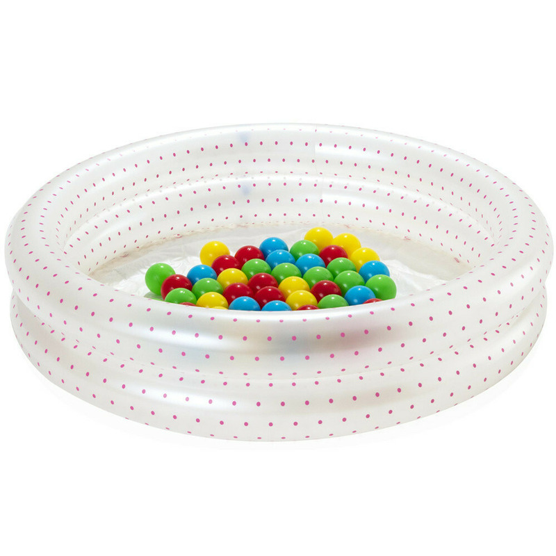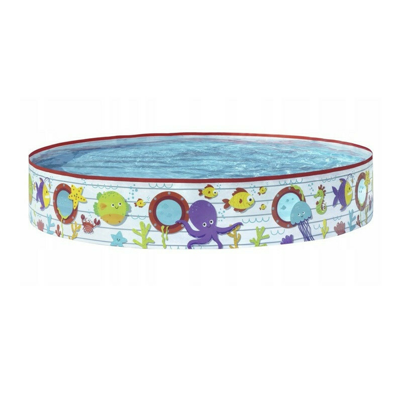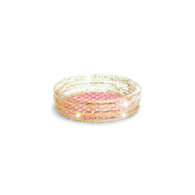
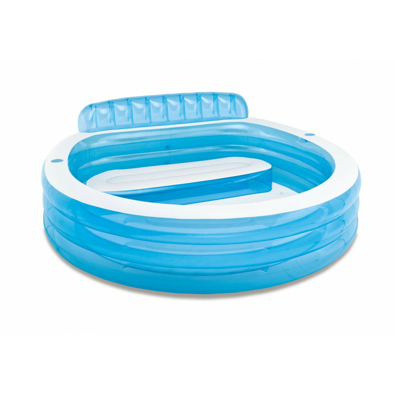
Piscina gonflabila cu scaun, Intex, family center, 57190np, 224 x 216 x 76 cm
bd-grid { display: grid; display: grid; grid-template-columns: repeat(3, minmax(0, 1fr)); row-gap: 50px; column-gap: 50px; justify-items: center; text-align: center; } @media screen and (max-width: 600px) { .
bd-grid { display: grid; grid-template-columns: repeat(1, minmax(0, 1fr)); } } .
bd-grid-s { display: grid; display: grid; grid-template-columns: repeat(2, minmax(0, 1fr)); row-gap: 50px; column-gap: 50px; justify-items: center; text-align: center; align-items: center; } @media screen and (max-width: 600px) { .
bd-grid-s { display: grid; grid-template-columns: repeat(1, minmax(0, 1fr)); } } PISCINA GONFLABILA CU SCAUN Perfect pentru intreaga familie Dimensiune mare: 229 x 218 cm x 79 cm Un scaun mare pentru mai multe persoane cu spatar 2 suporturi pentru bauturi Supapa de golire pentru evacuarea rapida a apei Plasture de reparatie inclus Produs marca INTEX IDEAL PENTRU TOATA FAMILIA DIMENSIUNE MARE - datorita acestui fapt, piscina este potrivita atat pentru copii, cat si pentru adulti.
Piscina din PVC, culori placute si sezut cu spatar – este o optiune de relaxare, ideala pentru tine si familia ta.
bd-grid { display: grid; display: grid; grid-template-columns: repeat(3, minmax(0, 1fr)); row-gap: 50px; column-gap: 50px; justify-items: center; text-align: center; } @media screen and (max-width: 600px) { .
bd-grid { display: grid; grid-template-columns: repeat(1, minmax(0, 1fr)); } } .
bd-grid-s { display: grid; display: grid; grid-template-columns: repeat(2, minmax(0, 1fr)); row-gap: 50px; column-gap: 50px; justify-items: center; text-align: center; align-items: center; } @media screen and (max-width: 600px) { .
bd-grid-s { display: grid; grid-template-columns: repeat(1, minmax(0, 1fr)); } } CANAPEA GONFLABILE CONFORTABILA Datorita acesteia, piscina se deosebeste de celealte produse similare.
Canapeaua gonflabila, cu spatar este un loc ideal pentru odihna confortabila.
Va bucurati de vremea frumoasa si copiii tai se distreaza de minune.
SPECIFICATII: Lungime: 224 cm Latime: 216 cm Inaltime: 76 cm Dimensiuni pachet: 46x41x15 cm Material: PVC Număr camere de pompare: 3 camere Capacitate: 590L Inaltimea nivelului apei: 30 cm Greutate: 7,6 kg Cod produs: 57190 .
bd-grid { display: grid; display: grid; grid-template-columns: repeat(3, minmax(0, 1fr)); row-gap: 50px; column-gap: 50px; justify-items: center; text-align: center; } @media screen and (max-width: 600px) { .
bd-grid { display: grid; grid-template-columns: repeat(1, minmax(0, 1fr)); } } .
bd-grid-s { display: grid; display: grid; grid-template-columns: repeat(2, minmax(0, 1fr)); row-gap: 50px; column-gap: 50px; justify-items: center; text-align: center; align-items: center; } @media screen and (max-width: 600px) { .
bd-grid-s { display: grid; grid-template-columns: repeat(1, minmax(0, 1fr)); } } .
bd-grid { display: grid; display: grid; grid-template-columns: repeat(3, minmax(0, 1fr)); row-gap: 50px; column-gap: 50px; justify-items: center; text-align: center; } @media screen and (max-width: 600px) { .
bd-grid { display: grid; grid-template-columns: repeat(1, minmax(0, 1fr)); } } .
bd-grid-s { display: grid; display: grid; grid-template-columns: repeat(2, minmax(0, 1fr)); row-gap: 50px; column-gap: 50px; justify-items: center; text-align: center; align-items: center; } @media screen and (max-width: 600px) { .
bd-grid-s { display: grid; grid-template-columns: repeat(1, minmax(0, 1fr)); } }.