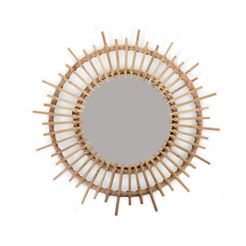
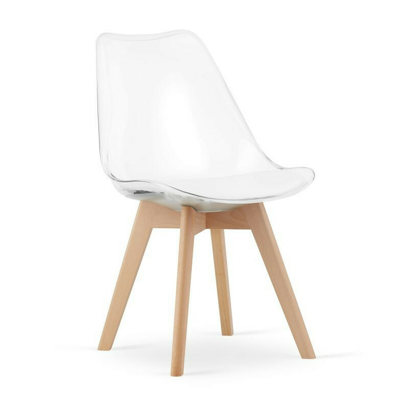
Multistore Set 4 scaune moderne, stil scandinav cu picioare din lemn masiv si perna din piele ecilogica, transparente
bd-grid { display: grid; display: grid; grid-template-columns: repeat(3, minmax(0, 1fr)); row-gap: 50px; column-gap: 50px; justify-items: center; text-align: center; } @media screen and (max-width: 600px) { .
bd-grid { display: grid; grid-template-columns: repeat(1, minmax(0, 1fr)); } } .
bd-grid-s { display: grid; display: grid; grid-template-columns: repeat(2, minmax(0, 1fr)); row-gap: 50px; column-gap: 50px; justify-items: center; text-align: center; align-items: center; } @media screen and (max-width: 600px) { .
bd-grid-s { display: grid; grid-template-columns: repeat(1, minmax(0, 1fr)); } } Set 4 scaune moderne, stil scandinav cu picioare din lemn masiv si perna din piele ecilogica, transparente Scaunele moderne cu perna sunt piesa de mobilier perfecta pentru living sau sufragerie.
Designul simplu în stil scandinav face ca scaunul să arate grozav atat in interiorul modern, cat si in cel clasic.
Cu forma sa interesanta, scaunul va da perfect aspectul potrivit oricarei incaperi, se potriveste biroului, restaurantului, bucatariei, dar si livingului si sufragerii.
Finisajul atent al mobilierului ii mareste atractivitatea, iar designul modern si forma interesanta creeaza o combinatie perfecta chiar si pentru cei mai pretentiosi utilizatori.
Scaunele sunt construite din polipropilena (plastic) transparenta.
Datorita acestui lucru, puteti ajusta scaunele la orice interior.
CARACTERISTICILE PRODUSULUI set de 4 scaune cu perna; scaun confortabil; design modern; Picioare din lemn de fag (cadru); Polipropilena din plastic (spatar); Sarcina admisa: 120 kg; Perna din piele ecologica de culoarea spatarului; pentru auto-asamblare (10 min).
Scaun: Inaltime totala: 82 cm; Latime totala: aproximativ 50 cm; Adâncime totală: aproximativ 50 cm; Perna: Adancime: 38 cm; Latime: 44 cm; Scaun: Adancime: 42 cm; Latime: 48 cm; Inaltime de la sol: 46 cm; A sustine: Inaltime spatar: 40 cm; Lățimea cea mai mare: 48 cm; Latime in partea de sus: 30 cm; Specificație: Cod: 3752; P roducator : Multistore; Setul include: 4 scaune; Culoare: transparent; Finisaj: lemn de fag; Greutatea scaunului: 4,4 kg; Greutatea setului: aproximativ 25 kg; Ambalare: cutie de transport special securizata; Asamblare: aproximativ 5 minute; Garantie: 24 luni.
bd-grid { display: grid; display: grid; grid-template-columns: repeat(3, minmax(0, 1fr)); row-gap: 50px; column-gap: 50px; justify-items: center; text-align: center; } @media screen and (max-width: 600px) { .
bd-grid { display: grid; grid-template-columns: repeat(1, minmax(0, 1fr)); } } .
bd-grid-s { display: grid; display: grid; grid-template-columns: repeat(2, minmax(0, 1fr)); row-gap: 50px; column-gap: 50px; justify-items: center; text-align: center; align-items: center; } @media screen and (max-width: 600px) { .
bd-grid-s { display: grid; grid-template-columns: repeat(1, minmax(0, 1fr)); } } .
bd-grid { display: grid; display: grid; grid-template-columns: repeat(3, minmax(0, 1fr)); row-gap: 50px; column-gap: 50px; justify-items: center; text-align: center; } @media screen and (max-width: 600px) { .
bd-grid { display: grid; grid-template-columns: repeat(1, minmax(0, 1fr)); } } .
bd-grid-s { display: grid; display: grid; grid-template-columns: repeat(2, minmax(0, 1fr)); row-gap: 50px; column-gap: 50px; justify-items: center; text-align: center; align-items: center; } @media screen and (max-width: 600px) { .
bd-grid-s { display: grid; grid-template-columns: repeat(1, minmax(0, 1fr)); } }.
961.00 Lei
Multistore Set 4 scaune moderne, stil scandinav cu picioare din lemn masiv si perna din piele ecilogica, transparente
961.00 Lei